The UC analytics dashboards that change staffing decisions and SLA outcomes at Philippine enterprises track between 5 and 10 unified communications KPIs. RingCentral’s platform ships with 30+ pre-built KPIs and target filters; the first job after deployment is deciding which 25 to ignore.
TL;DR: Effective enterprise dashboard design for UC starts by filtering down to 5–10 metrics tied to specific business actions. Philippine BPOs, hospitals, and multi-site offices each need different metric hierarchies, but all share one test: if a number doesn’t trigger a decision (staffing change, escalation, network ticket), it doesn’t belong on the screen.
The Filtering Problem
A dashboard displaying 30 indicators at once doesn’t accelerate decision-making. It paralyzes it. The enterprise dashboard design benchmark gaining traction in 2026 is the 5-second test: can a manager grasp the dashboard’s main message within 5 seconds of looking at it? If not, the dashboard has too many competing signals.
Gartner research puts the cost of poor data quality at $12.9 million per year per organization, and one of the most common contributors to that figure is dashboards showing data nobody acts on. Numbers that sit on a screen without triggering a staffing change, an escalation, or a network ticket are operational decoration.
For Philippine enterprises running UC platforms like Yeastar P-Series, Cisco Webex Calling, or RingCentral MVP, the filtering exercise is identical regardless of vendor. You need a hierarchy of UC performance metrics, and that hierarchy depends on what your organization actually does.
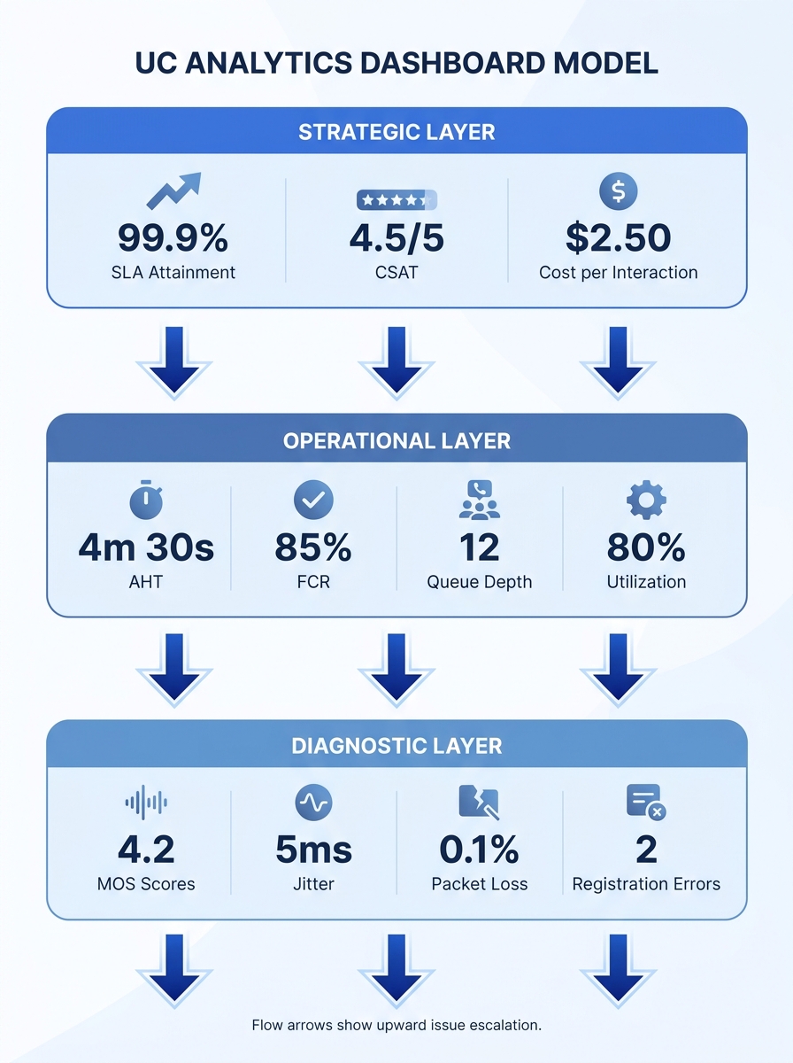
The Three-Layer Dashboard Model
The COO reviewing weekly SLA compliance and the team lead watching live queue depth need different views of the same underlying data. A layered approach keeps each audience focused on what they can control. Here’s a framework that maps to how Philippine enterprises typically operate.
Layer 1 — Strategic (executive view). This tracks 3–5 outcome metrics updated daily or weekly: overall SLA attainment (percentage of calls answered within target time), CSAT score, cost per interaction, and uptime percentage across all UC endpoints. These go to the C-suite and department heads. They answer one question: is the communication infrastructure making money or losing it?
Layer 2 — Operational (team lead view). This runs in near-real-time with 5–8 metrics: queue depth, average handle time (AHT), first call resolution (FCR) rate, agent utilization rate, and abandoned call percentage. BPO team leads in Makati or Cebu IT Park make minute-by-minute staffing decisions off these numbers. If your organization uses Erlang capacity modeling for staffing, this is where model predictions meet live data.
Layer 3 — Diagnostic (IT/engineering view). This pulls from packet-level and flow-level data. Mean Opinion Score (MOS), jitter, packet loss, registration failures, and codec negotiation errors live here. VIAVI Solutions describes this layer as combining packet and flow-based insights into actionable visualizations that trace a call’s quality through the network. IT teams watching Layer 3 catch degradation before it reaches the operational metrics above.
Which Metrics Drive Decisions in Philippine Contexts
Philippine enterprises face specific pressures that alter which call center analytics and UC performance metrics deserve top billing. A BPO seat farm in BGC handling 40,000 inbound calls per day needs a fundamentally different dashboard than a provincial hospital’s 15-extension system or a multi-branch bank with 30 offices across Luzon, Visayas, and Mindanao.
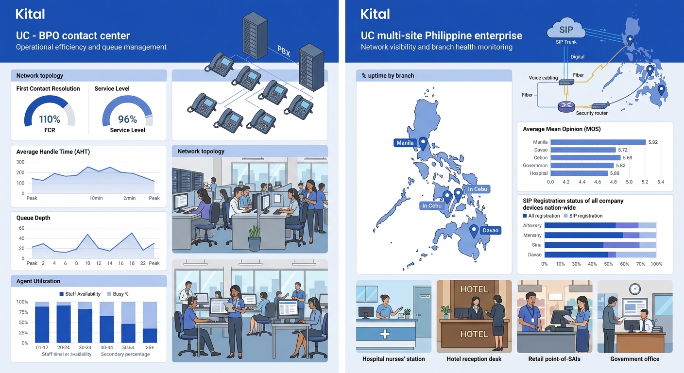
BPO and Contact Centers
Call center analytics for Philippine BPOs revolve around four numbers: FCR rate, AHT, CSAT, and service level (percentage of calls answered within X seconds). FCR correlates most strongly with both customer satisfaction and cost efficiency. An FCR improvement from 68% to 75% typically reduces repeat call volume by 15–20%, which directly lowers headcount requirements.
Agent utilization rate matters, but it’s a second-tier metric. Targeting above 85% utilization often degrades FCR because agents rush through interactions. The dashboard should display utilization alongside FCR so team leads can see when efficiency pressure starts hurting resolution quality.
As Nextiva documents in their platform architecture, building analytics directly into the contact center platform eliminates data silos and delayed insights. When analytics sit outside the UC platform as a bolt-on tool reading CDR exports, delays of 15–30 minutes between event and visibility are typical. That latency kills the value of real-time operational dashboards.
Multi-Site Enterprises
For banks, hotel chains, and government agencies spread across Philippine geography, the metrics shift. Uptime per site becomes the lead indicator. A branch in Davao losing SIP registration for 45 minutes during business hours is an incident that a Makati-based NOC needs to catch in seconds, not discover in a weekly report.
Inter-site call quality (MOS scores between locations) is the second critical metric, because call quality degradation across WAN links reveals network problems that affect all UC services simultaneously. A multi-site enterprise dashboard should group metrics by location and flag any site falling below threshold with a color-coded alert.
Hospitals and Schools
These environments care about availability and adoption more than throughput. The relevant unified communications KPIs are endpoint registration percentage (how many devices are online), paging system uptime, and adoption rate (what percentage of staff actually use the UC platform versus reverting to personal mobile phones). Adoption rate is a metric most enterprises forget to track, and it’s the one that determines whether your UC investment produces returns. If you’ve been through a UC implementation and change management process, adoption rate tells you whether the change actually stuck.
Choosing a Visualization Platform
The visualization layer sits on top of your UC platform’s data exports, CDR databases, and SNMP/syslog feeds. Philippine enterprises typically land on one of four options, depending on budget and IT team maturity.
| Platform | Cost Structure | UC Data Integration | Best Fit |
|---|---|---|---|
| Microsoft Power BI | Pro license ~$10/user/month | Native connectors for Teams; REST API for others | Enterprises already on Microsoft 365 |
| Grafana (open source) | Free self-hosted; Cloud from $0 | Prometheus, InfluxDB, Elasticsearch connectors | IT teams comfortable managing infrastructure |
| Metabase (open source) | Free self-hosted; Cloud from $85/month | SQL-native; connects to any CDR database | Mid-market companies wanting self-service BI |
| Vendor-native (RingCentral, Yeastar, Cisco) | Included with platform license | Deep integration with own platform only | Single-vendor UC environments |
Grafana deserves specific attention for UC analytics. It integrates with hundreds of data sources and, as of 2026, includes AI-powered anomaly detection that flags unusual patterns before they cascade into dropped calls. The catch: Grafana requires an IT team willing to maintain the deployment, write queries, and build dashboards from scratch.
For organizations that want pre-built UC dashboards without that overhead, vendor-native analytics (RingCentral Live Reports, Yeastar QueueMetrics, Cisco Webex Control Hub) are the path of least resistance. RingCentral’s Live Reports, for instance, let teams “instantly view and understand queue patterns and trends” to inform staffing and SLA management. The trade-off is vendor lock-in: your dashboard shows only what that vendor’s platform produces.
Tip: If your UC environment spans multiple vendors (common in Philippine enterprises that have grown through acquisition), Grafana or Power BI are the realistic options for a single-pane view. Vendor-native dashboards won’t display data from competing platforms.
Data Quality as the Hidden Foundation
A dashboard is only as trustworthy as the data feeding it. One practice gaining traction in enterprise dashboard design is displaying a data quality score directly on the dashboard itself: a percentage or gauge reflecting the completeness, freshness, and accuracy of underlying data streams.
This matters especially for Philippine deployments where connectivity varies by region. If your Zamboanga branch’s CDR feed hasn’t synced in 48 hours because of a circuit outage, the dashboard’s AHT and FCR calculations for that branch are stale. Without a visible quality indicator, a manager might make staffing decisions based on incomplete numbers.
Practical implementation: timestamp every data source feed, compute a freshness score (green if within 5 minutes, yellow if 5–60 minutes, red if over 60 minutes), and display it as a small indicator next to each metric group. When the indicator turns red, the dashboard communicates that the numbers shouldn’t be trusted for real-time decisions.
If a metric doesn’t trigger a specific decision, it doesn’t belong on the dashboard. And if the data behind the metric is stale, the decision it triggers could be worse than no decision at all.
Converting user feedback and call quality complaints into network intelligence is another data source that most Philippine enterprises overlook. Sentiment data from post-call surveys, mapped against MOS scores and network metrics for the same calls, can reveal whether technical quality issues are actually driving customer dissatisfaction or whether the problem is procedural.
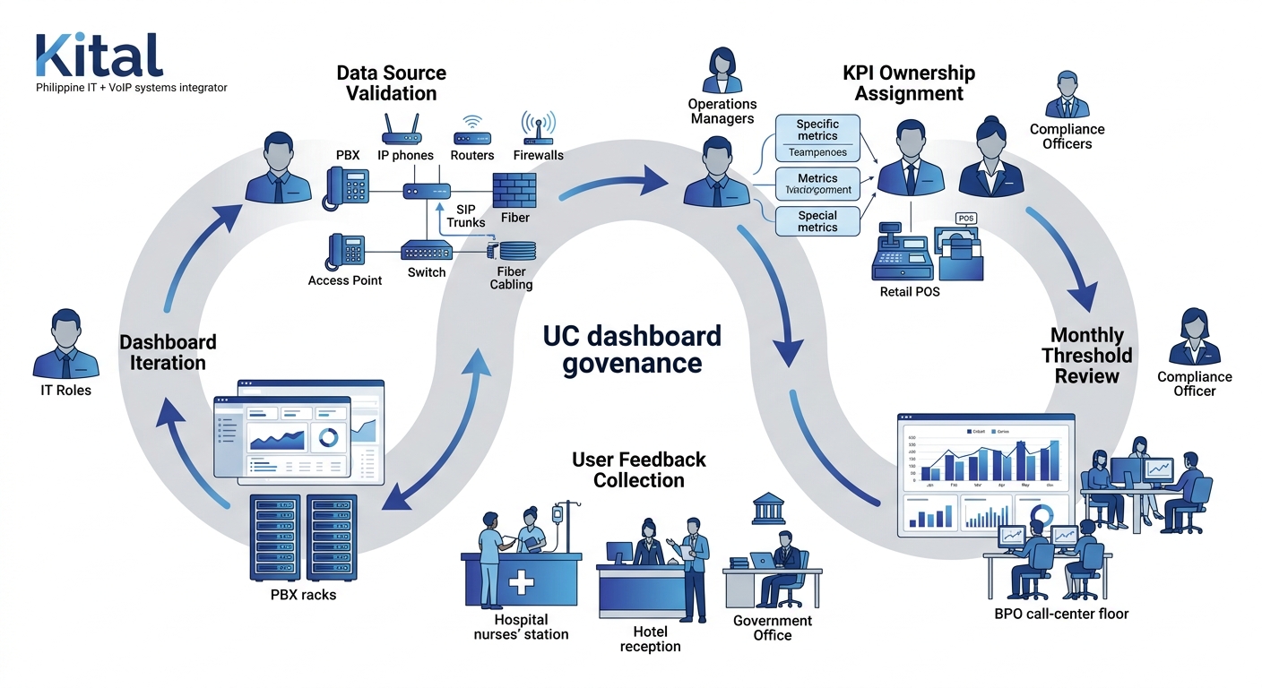
Who Owns the Dashboard After Launch
NoJitter’s analysis of UC data as a productivity tool describes IT leaders mining metadata from UC platforms to reveal how teams communicate, when they collaborate, and how sentiment shifts over time. That kind of ongoing analysis requires sustained attention. A dashboard that hasn’t been reviewed and updated in six months is almost certainly showing metrics that no longer align with business priorities.
Assign each KPI an owner: a named person responsible for reviewing thresholds, acting on alerts, and proposing changes when a metric stops being useful. For BPO operations, the FCR target owner might be the quality assurance manager. For network health metrics, ownership sits with the NOC lead. Without ownership, dashboards decay into wallpaper that’s always visible but never read.
Governance also covers access control. Philippine data privacy regulations under the National Privacy Commission require that dashboards displaying agent-level performance data restrict access to authorized supervisors. Role-based access in this context is a compliance requirement, not a nice-to-have. Both Power BI and Grafana support row-level security that can enforce these boundaries without building separate dashboard instances per role.
The Open Threads
The shift from descriptive analytics (“what happened”) to predictive analytics (“what will happen”) is well underway in UC platforms, but Philippine enterprises face practical barriers. Predictive models need historical data density that many local deployments lack. You can’t train an anomaly detection model on six months of CDR data from a 50-seat office and expect reliable predictions.
Where analytics processing happens also remains an open question. Cloud-based UC platforms push analytics to vendor infrastructure, which simplifies deployment but creates dependency on international links that Philippine ISPs don’t always deliver consistently. On-premises analytics give you control but demand local compute resources and staff with the skills to maintain them.
And there’s the cultural dimension. Philippine organizations that have invested in UC analytics dashboards report that the hardest part isn’t building the dashboard. It’s getting managers to trust the numbers over intuition and actually change behavior based on what the data shows. That adoption gap is where most enterprise dashboard design projects stall, regardless of how technically polished the visualization layer is. If you’re working through these questions for your own organization, get in touch with our team to map out which metrics and platform architecture fit your specific vertical and scale.